Wednesday, 30 April 2014
Tuesday, 1 April 2014
Contact sheet


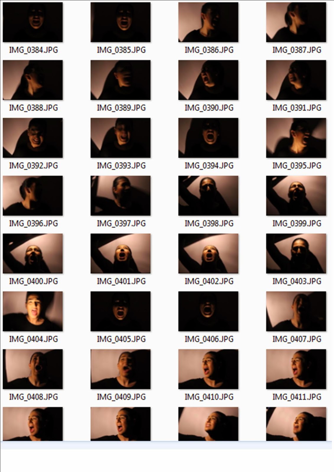


In the preparation of making a horror poster and magazine cover, I had taken time out to take some pictures which I could use. I had taken over 160 images as I knew there will be images that would be useless and ones which may come in handy. I had taken shots suitable for a horror trailer or magazines such as shadow images, scream images, strangling images, and knife images. After analysing these images, I had come up with many more ideas in terms of choosing the layout of my poster or magazine to target my audience of a horror genre.

The picture above includes the props I had used to create the horror genre i.e. the knife, and the lamp and torch to ensure that the lighting was right. The sofa was used to take pictures of a hand grabbing the sofa as it was a object that was dark and soft.
Rough sketches for poster/magazine

Firstly, I had sketched some ideas which relate to the horror genre targeting my audiences. The first image related to my idea of a half face shot of a scream symbolising fear. I had then taken some real life pictures which I could use if i decided to stick to the idea. The second image is a side shot of the main character screaming with a slogan above setting the genre. The third image is a landscape view as during my research i had come across many posters that were landscape where a wide shot of a photo would be ideal. For example where the main scene in my practical trailer was a forest, a landscape view for a poster would be ideal, however its not always necessary and can be done successfully through portrait view. The fourth image was of a full body shot which was another idea I liked. In this sketch, i liked the idea of an upside down body shot which i believe was very different to many other posters. this creates a sense of confusion. These images below we triggers to my ideas which i had altered during my research.


Subscribe to:
Comments (Atom)